So I love Spiceworks. For small organizations it really does give their I.T. people an amazing resource. I also like to make posters. So when I first heard that they were running a poster contest for their annual conference years ago I felt that I just had to join in.
2009
2009 was the first year I participated. I hadn’t really done anything for graphical contests before, and since there wasn’t an entry fee I decided to try my hand. I ended up creating and entering three different designs, none of them won. What was most important was that I was having fun and working my design muscles.
2010
By the time the 2010 contest rolled around, I had started playing with Blender, a graphics program that allows you to create and render three-dimensional graphics (not the 3d glasses kind, the Pixar/Dreamworks kind). I was also learning a bit more about composition and layout as it pertains to posters. Two of my submissions made it to the finals this year, and my first submission, “The Heroes are Coming” won the contest.
2011
In 2011, Spiceworks changed the venue for their conference. Formerly at the world-famous Alamo Drafthouse, the 2011 conference would be held at the AT&T Conference Center. To honor the Drafthouse, the poster submissions were to have a movie theme. I think this was my favorite year, as there were so many possible movie posters I would love to pay homage to. Due to time constraints I only made two posters, but the “OfficeSpice” poster took a while. Once again, I wanted to do something fun with Blender. My “OfficeSpice” submission took first place this year.
2012
In 2012, I took a departure from the Blender work and was leaning a bit towards minimal illustrations, trying to really express what I wanted without a lot of “flash”. My “Biohazard” poster won this year.
2013
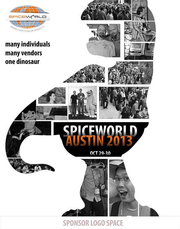
Initially, they weren’t going to run a contest for 2013. While a little sad that I wouldn’t get the opportunity to flex my poster muscles again, I had fun while it lasted. As it got closer to the conference, however, they decided to run the poster contest again. Due to the short notice, I was only able to work one up. It was a take of the movie poster for “Vantage Point”. I felt it would be really nice to showcase all of the people (attendees, vendors and staff) who make the conference great. I won this year as well.
In Closing
Overall, I think the poster contests helped me hone my craft, in a fun way, without any of the usual “the client needs it this way” type of stress. It was a fun way to let loose and have fun graphically. Thanks Spiceworks!


